Website redesign for 2022
 jenxi.com
 Vision alchemist crafting strategic innovation & AI adoption. Bridging startups to China's ecosystem advantage. Building a cyberbrain. Registered pharmacist × Brand strategist × Storyteller
2022 marks the 20th anniversary of this site. I redesigned the site to celebrate the milestone. I foresee more changes coming once full site editing makes it into Wordpress core in a couple of weeks.
Changes in the past year
I made many small tweaks to the site as It evolved into the current state. It continued the minimal look I adopted in the late 2010s with increased emphasis on typography.
Let’s look at the changes made over the past year or so.
Dark mode
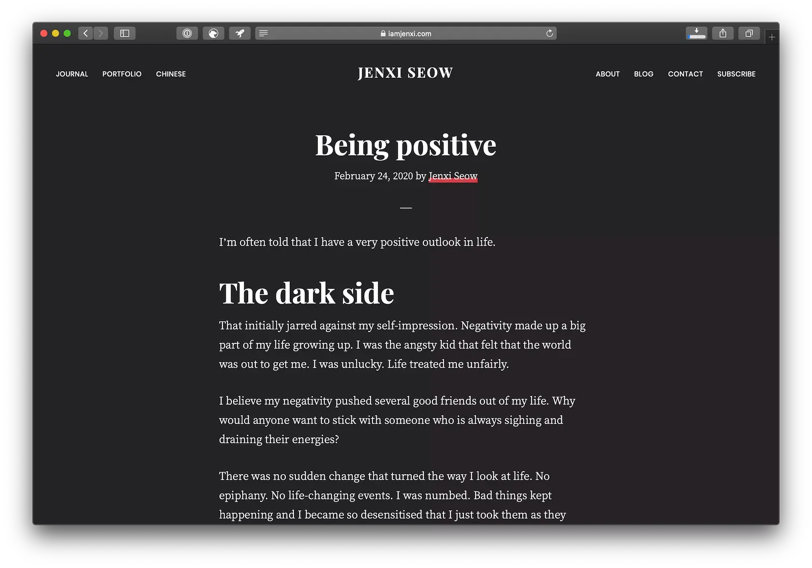
The biggest change in 2020 was the implementation of dark mode. It uses a CSS media query to check if the browser prefers dark mode, and display the dark mode styles if it is.
I made more refinements to the feature as dark mode became more widely adopted over the past year.
Type addict
A shameless typography geek, I have been lazy to implement custom fonts on my websites out of sheer laziness. Despite the ease of doing so since Google Fonts started serving beautiful fonts, it is still a workaround with the themes I use to build my sites.
This have changed with modern themes that have Google Font support built into them and the alternative of using @font-face to reference Google Fonts.
I hopped on the retro type bandwagon and went with a serif-serif font pairing of Playfair Display and Crimson Pro for that timeless classic look. The strong look of Playfair Display was perfect for headings and Crimson Pro has always been one of my favourite serif fonts for web use, since Minion Pro isn’t available for free.

Redesign to welcome 2022
The redesign sees the site coming a full circle, adopting styles that I used almost a decade ago. The stylistic choices are refined after honing my aesthetic taste over that period of time.

Return to minimalism
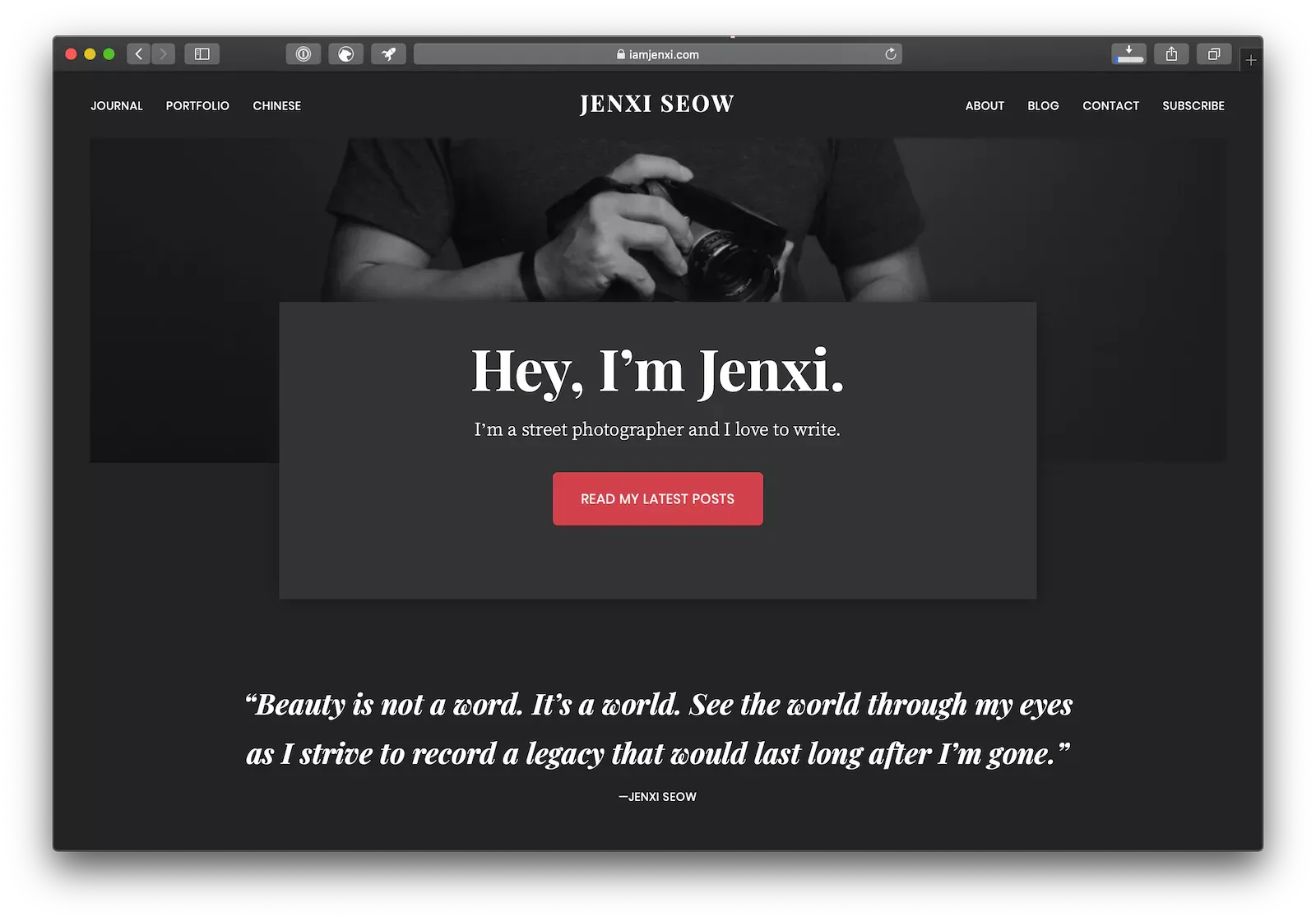
When I revamped the home page in 2020, I decided to implement trends popular then. I added floating boxes that were meant to give the illusion of depth, and slapped box shadows on them.
Back then, it was yet another return to an old style. I used shadows a lot back in the early 2000s, but that was for a skeuomorphic look that was trendy then.
I decided to get rid of the fancy fluff and returned to the minimalist look. No more shadows or layers. Everything is flat.
Yet, there is still some complexity within the minimalism. This is achieved through thin lines, both faded and in the red accent. This brings me to the next point.
Muted look
Where the old design shouted with the red accent colour to bring attention to Call-to-Action (CTA) buttons and links, this new look minimises the appearance of red.
The red only appears under links and when you hover on link items. Unlike the red link underline style of the old design, this new link is again minimal. Where the old style tries to look like highlights or marker underlines, this new approach is more refined and elegant.
Return of sans serif
We come to yet another full circle. The post kicked off talking about type, and it’s fitting that it ends talking about the new typography of this site.
Where the serif fonts went well with previous the fancy look, I decided to bring back a sans serif font for the headings. Not just any sans serif, though. It is my favourite sans serif font, Avenir Next. Unfortunately, it isn’t available as a web font. Avenir Next Pro is a close alternative but it’s paid. So that’s not an option.
If you’re lucky and your device supports Avenir Next, you get to enjoy the site with this beautiful font. Apple devices come with Avenir Next. I’m unsure what other devices have it installed by default.
Don’t worry if your device doesn’t support Avenir Next. There are several fallback sans serif fonts that still look good.
I choose PT Serif as the body font. Crimson Pro looks more classic compared to the more modern-looking PT Serif. This makes the latter pair better with the sans serif heading.
Under the hood
Besides the visual changes above, I made structural changes to the site layout. I had to use a CSS hack to make the text stay within the container and have images break out of the container.
This is no longer the case. The content uses a single container that keeps the text with the contained width while allowing elements like images and blockquotes the option of extending outside the container.
I’ve stopped using widgets in favour of blocks. While some of my other sites and client sites still rely on widgets, this site is now fully block-based. It helps that the minimalist design means I don’t have to worry about displaying content in widgets.
More structural changes will come once full site editing is available in Wordpress 5.9.