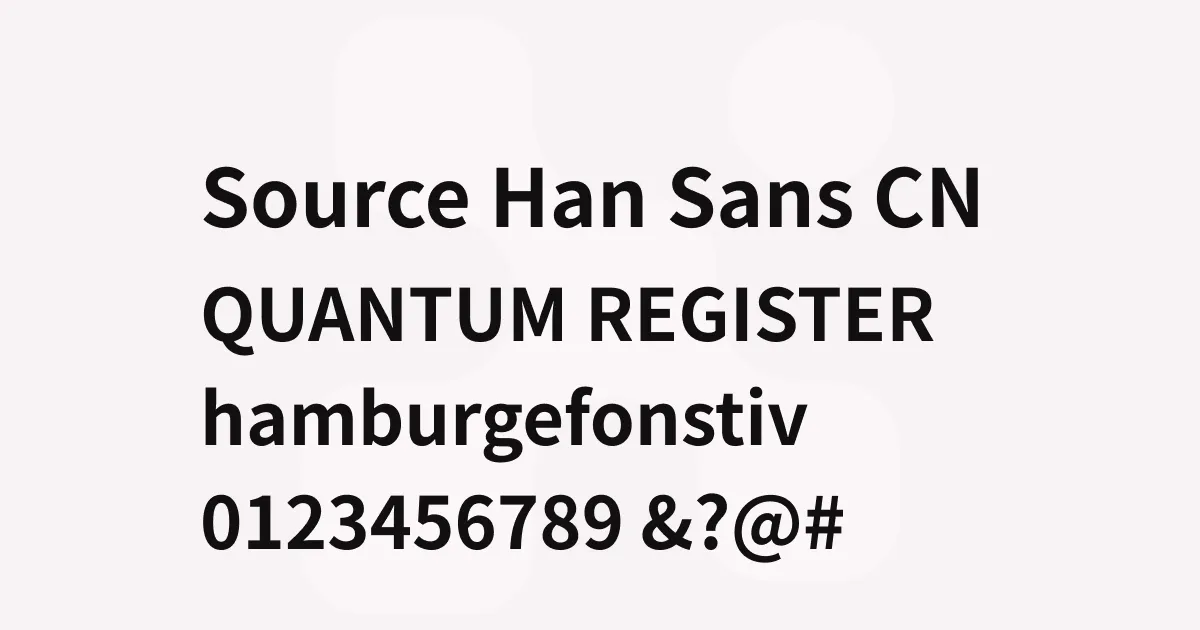
Source Han Sans
Description
Source Han Sans represents a landmark achievement in type design: the first truly comprehensive Pan-CJK typeface created through international collaboration. Developed jointly by Adobe and Google, the font family provides unified typographic coverage for Japanese, Korean, Simplified Chinese, Traditional Chinese (Taiwan), and Traditional Chinese (Hong Kong) writing systems—all while maintaining visual harmony and respecting each region’s distinct typographic traditions.
The design draws from the neutral, contemporary aesthetic of grotesque sans-serifs while incorporating the structural requirements of CJK character construction. Japanese lead designer Ryoko Nishizuka coordinated the overall vision, working with Sandoll Communications for Korean characters and Changzhou SinoType for Chinese variants. The result is a typeface where characters from different writing systems can coexist on the same page without visual conflict, sharing consistent stroke weights, proportions, and design sensibilities.
With over 65,000 glyphs across its complete family, Source Han Sans addresses a fundamental challenge in multilingual typography. The font includes region-specific character variants through OpenType localization features, automatically selecting the appropriate glyph forms based on language tags. Its seven weights provide excellent range for establishing hierarchy, while variable font versions offer continuous weight adjustment for modern web and application development.
Best uses
- Multilingual websites and applications serving East Asian markets
- Corporate branding requiring consistent CJK and Latin typography
- Editorial and publishing projects with mixed-language content
- User interfaces for software distributed across China, Japan, and Korea
- Government and institutional documents requiring broad character support
Thoughts
Source Han Sans stands as one of the most significant type design achievements of the 2010s—not just for its technical scope, but for demonstrating that open-source collaboration can produce world-class typography. The font performs admirably across screen and print, maintaining excellent legibility even at small sizes where CJK characters typically struggle.
The availability of identical fonts through both Adobe and Google (as Noto Sans CJK) makes it an extremely practical choice for cross-platform projects. The variable font releases have made it particularly valuable for web development, where serving comprehensive CJK fonts has traditionally been bandwidth-prohibitive. For anyone working on projects that span East Asian languages, Source Han Sans remains the benchmark against which other Pan-CJK typefaces are measured.
References
Specimens

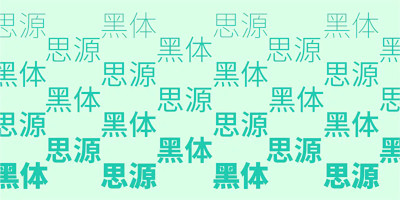
Source Han Sans Chinese glyph usage examples
Credit: Adobe

Source Han Sans Chinese glyph usage examples
Credit: Adobe
Source Han Sans Chinese weights
Credit: Adobe
Alternatives
- Noto Sans CJK by Google
- Hiragino Sans by Screen Holdings
- Yu Gothic by Morisawa
- Malgun Gothic by Microsoft