Polymath
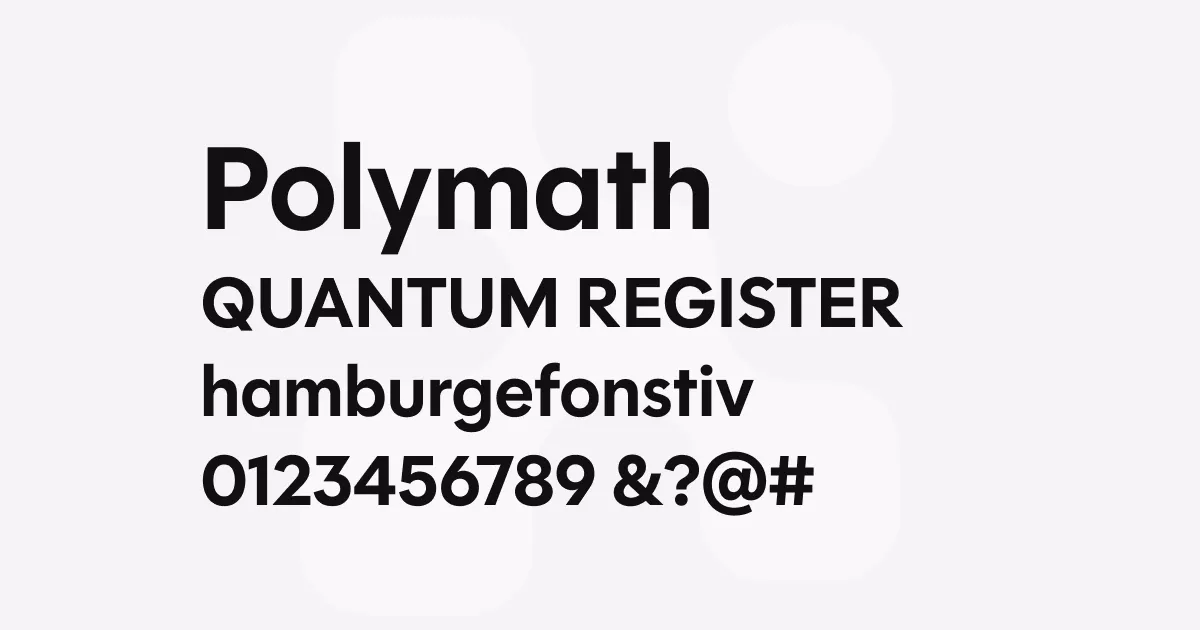
Description
Polymath is a comprehensive geometric sans-serif superfamily that brings fresh perspective to one of typography’s most ubiquitous categories. Taking inspiration from different eras of geometric sans serifs, the text size draws from the 1920s with long ascenders and descenders and smaller x-height, the display size takes cues from the 1970s photo-type era with enormous x-height and tight spacing, while the standard size references geometric sans serifs from the late 1980s onward.
What sets Polymath apart is its extensive collection of stylistic alternates organised into 18 sets, ranging from conservative legibility forms to experimental variants that reference different periods in geometric typography history. The alternates include everything from double-story a and g forms to Bauhaus-inspired alternates, “gas-pipe” variants with abrupt curves, uncial-style characters, and even a “squiggly” g. This wealth of options allows designers to customise the typeface’s personality while maintaining consistent spacing and proportions.
The family comes in three optical sizes designed for different applications: Text (optimised for smaller sizes with increased legibility), Standard (the multipurpose workhorse), and Display (for large usage like signage and logotypes with tighter spacing). Each optical size includes nine weights from Thin to Black, all available in both Roman and Italic styles, totalling 54 individual fonts.
Best uses
- Corporate branding and identity systems where versatility and trustworthiness are essential
- Editorial design requiring multiple hierarchical levels across different optical sizes
- Way-finding and signage systems that benefit from the Display optical size’s impact
- Digital products and interfaces where the Standard size provides excellent screen readability
- Marketing materials that need to convey both professionalism and approachability
- Pharmaceutical, healthcare, and financial communications where the alternates provide conservative fallbacks
Thoughts
Polymath represents OH no Type Company’s most ambitious attempt to reimagine the geometric sans-serif for contemporary use. What impressed me most is how the foundry approached this oversaturated category with both respect for its history and genuine innovation.
The three optical sizes aren’t just scaled versions of each other—they’re thoughtfully designed for their intended use cases, with the Text size feeling genuinely comfortable for extended reading and the Display size commanding attention at large sizes.
The stylistic alternates are where Polymath truly shines. Rather than feeling like gimmicks, they serve as a comprehensive toolkit that lets designers navigate between conservative corporate needs and more expressive applications. The legibility alternates provide escape hatches for traditional clients, while options like the uncial ‘a’ and experimental ‘g’ forms push boundaries without compromising the overall system’s integrity.
Having used it across several branding projects, I appreciate how Polymath manages to feel both familiar and fresh. It doesn’t scream for attention like some display fonts, but it’s far from boring. The spacing is exceptional, retaining its beauty across different media and sizes.
References
Specimens
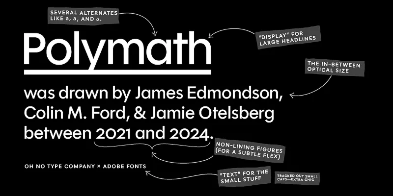
Different styles and alternates of Polymath on Adobe Fonts
Credit: OH no Type Company
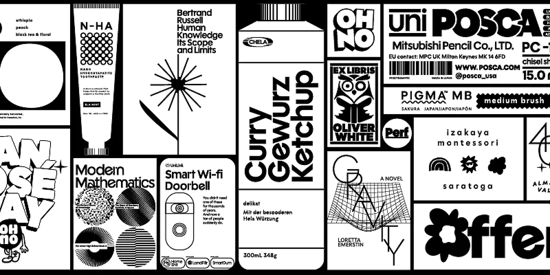
Selection of applications on Adobe Fonts
Credit: OH no Type Company
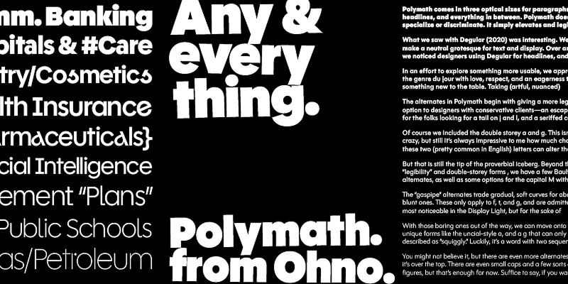
Weight example on Adobe Fonts
Credit: OH no Type Company
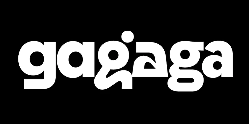
Different forms of g and a on Adobe Font
Credit: OH no Type Company
Alternatives
- Futura by Bauer Type Foundry
- Avenir by Linotype
- Proxima Nova by Mark Simonson Studio
- Brandon Grotesque by HVD Fonts