Orpheus
Description
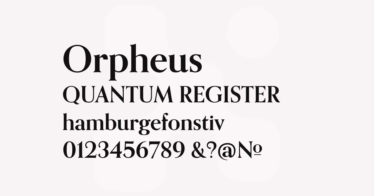
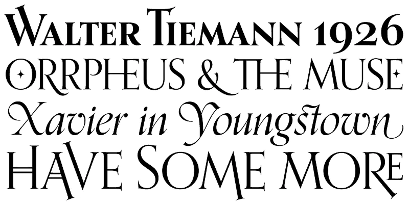
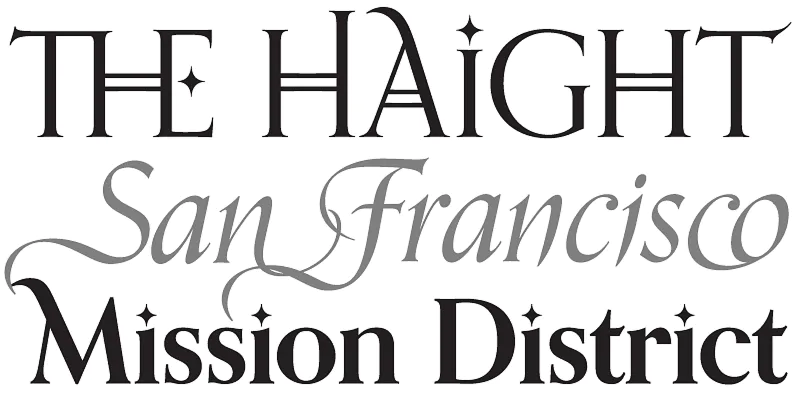
Orpheus Pro is rooted in two late 1920s designs by Walter Tiemann, who had an impressive talent for combining classic Roman proportions and Art Deco sensibilities. The typeface represents a masterful fusion of traditional empire capitals with a lowercase that showcases the efficient rhythm of modernist minimalism that defined German typography in the interwar period.
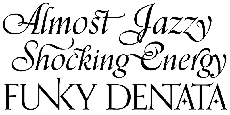
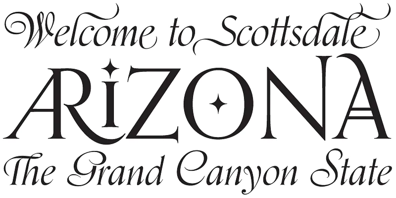
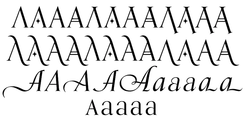
The typeface features a beautiful, flowing italic design that takes on a calligraphic feel, especially in the huge collection of ornate ligatures, alternate and swash characters. What began as a straightforward revival evolved into a comprehensive type system, with each font containing over 1000 glyphs. The italic, originally released separately as Euphorion in 1936, is particularly remarkable—Tiemann created multiple sets of capitals ranging from traditional forms to exuberant calligraphic swashes that showcase formal elegance at its finest.
The digital revival by Patrick Griffin and Kevin Allan King expands significantly on Tiemann’s original vision, adding extensive alternates, swashes, and ligatures that make Orpheus Pro exceptionally versatile for display typography while maintaining its readability in text settings.
Best uses
- Luxury branding and high-end packaging design requiring sophisticated elegance
- Entertainment industry applications including film posters and credits
- Editorial design for magazines and publications seeking refined character
- Wedding invitations and formal event materials needing calligraphic grace
- Corporate communications where classic sophistication meets contemporary style
- Product packaging for premium consumer goods
Thoughts
Orpheus Pro stands out as one of those rare typefaces that successfully bridges historical elegance and contemporary utility. The extensive character set—particularly the italic with its multiple swash capital sets—provides incredible flexibility for creating distinctive, memorable designs without sacrificing professionalism.
What impresses me most is how the typeface maintains clarity even with all its decorative potential. The base letterforms are beautifully balanced, and the ornamental features feel like thoughtful additions rather than excessive decoration. The Art Deco influences give it a timeless quality that works equally well for vintage-inspired designs and modern luxury branding.
The digital revival clearly involved immense care—the expansion from a simple revival to a comprehensive type system with over 1000 glyphs per font demonstrates real commitment to making this historical gem relevant for contemporary design practice. It’s particularly effective in contexts where you need elegance that feels both established and distinctive.
References
Specimens
Orpheus Pro on Adobe Fonts
Credit: Canada Type
Orpheus Pro on Adobe Fonts
Credit: Canada Type
Orpheus Pro on Adobe Fonts
Credit: Canada Type
Orpheus Pro on Adobe Fonts
Credit: Canada Type
Orpheus variations on Adobe Fonts
Credit: Canada Type
Alternatives
- Garamond Premier Pro by Adobe
- Baskerville by Various
- Minion Pro by Adobe
- Hoefler Text by Hoefler & Co
- Mrs Eaves by Emigre