House of Cards
Description
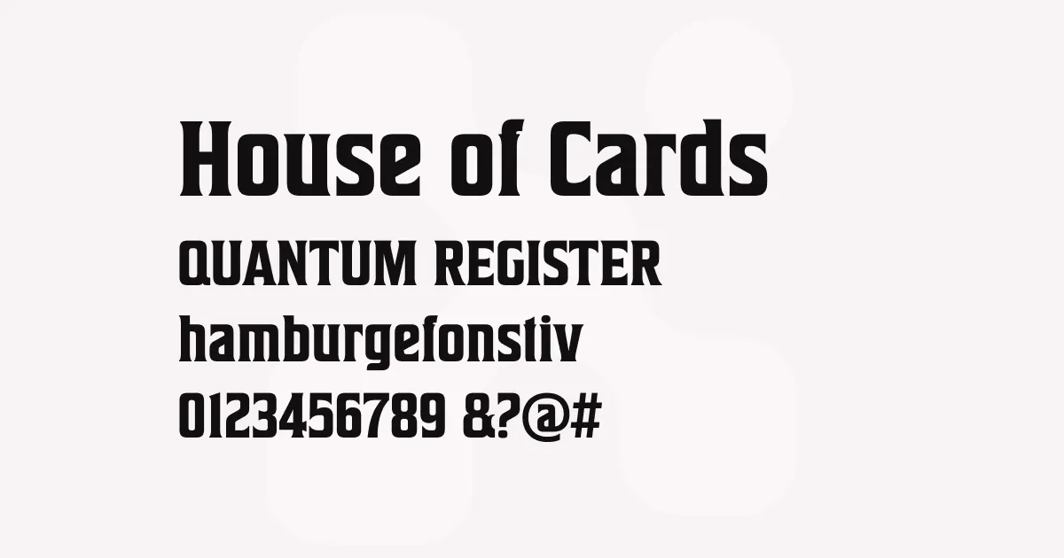
House of Cards is a vintage-inspired display serif typeface that authentically captures the spirit of 19th-century wood type while remaining distinctly contemporary. Based on Hamilton’s Teniers, one of the era’s most beloved wood type designs, this typeface balances historical accuracy with modern usability through carefully considered modifications.
The font’s most distinctive feature is its collection of sprayed stroke alternates for letters such as F, H, P, U, f, h, m, n, t, u, and w. These alternates, accessible through OpenType Stylistic Alternates or Swash features, add organic texture and authentic wood type character to designs. The slightly weathered appearance evokes the imperfect yet charming nature of letterpress printing, where ink coverage varied and edges showed natural wear.
Each glyph retains the robust proportions and confident presence of classic wood type, with generous x-heights and sturdy serifs that ensure legibility even at display sizes. The lowercase characters have been subtly refined from the original Teniers design to feel more natural to contemporary eyes while maintaining the nostalgic essence that makes vintage typography so appealing.
Best uses
- Poster designs requiring authentic vintage character
- Title treatments for retro-themed projects
- Brand identities with heritage or craft positioning
- Packaging design for artisanal or nostalgic products
- Editorial headlines in magazines and publications
- Event collateral with period-appropriate aesthetics
Thoughts
House of Cards succeeds where many vintage revivals fall short by striking a careful balance between historical authenticity and practical versatility. The sprayed stroke alternates are particularly well-executed—they add period-appropriate texture without compromising legibility or feeling gimmicky.
The family’s two weights (Regular and Bold) with matching italics provide sufficient flexibility for most display applications, though designers working on complex hierarchy systems might wish for additional weights. The Bold weight particularly shines in poster and title applications, where its substantial presence commands attention while the sprayed alternates add tactile warmth.
What makes this typeface especially valuable is its ability to evoke specific historical periods without feeling like a costume. The slightly refined lowercase characters prevent the design from feeling too precious or museum-like, making it suitable for contemporary brands that want to reference vintage aesthetics without appearing dated. I’ve found it works particularly well for craft beverage packaging and event posters where authentic character matters more than clinical precision.
The OpenType features are thoughtfully implemented—the alternates appear natural rather than forced, and the italic styles maintain the wood type character while providing genuine cursive construction. For designers building vintage-inspired brand systems or creating period-appropriate editorial content, House of Cards offers an authentic foundation that feels researched rather than pastiche.
References
Specimens
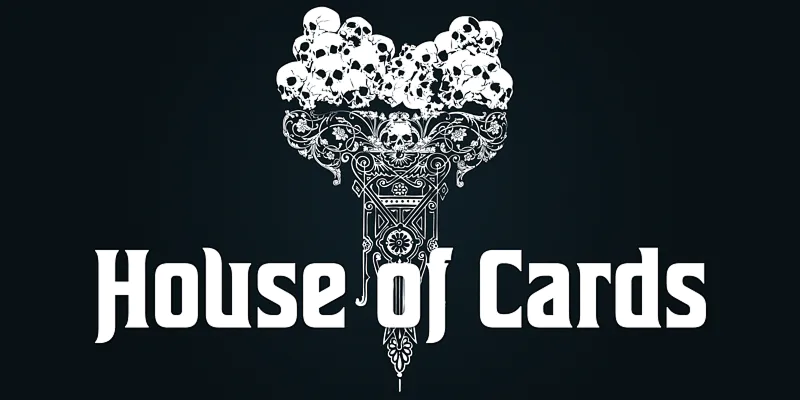
House of Cards example on Adobe Fonts
Credit: Dharma Type
House of Cards example on Adobe Fonts
Credit: Dharma Type
House of Cards stylistic alternates and sprayed stroke example on Adobe Fonts
Credit: Dharma Type
Alternatives
- Rama Slab E by Dharma Type
- Sheepman by Dharma Type
- Etna by Mostardesign
- Clarendon by Various
- Playfair Display by Claus Eggers Sørensen