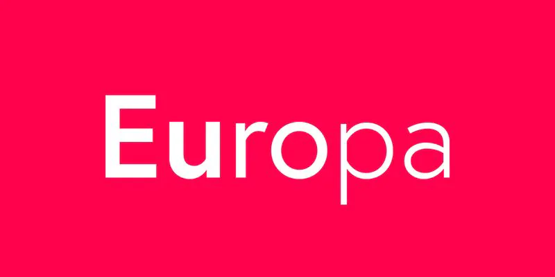
Europa
Description
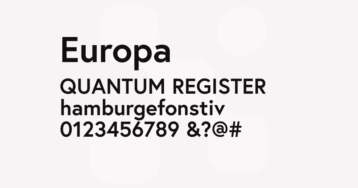
Europa is a contemporary geometric sans-serif that refines the modernist tradition established by typefaces like Futura. Designer Fabian Leuenberger has crafted a typeface that retains the clean, circular forms characteristic of geometric sans-serifs while introducing subtle humanist touches that add warmth and improve readability, particularly at smaller sizes and on screen.
The typeface features a moderate x-height and open apertures, which contribute to its excellent legibility. Unlike the more rigid geometric constructions of its predecessors, Europa incorporates slightly curved terminals and optically adjusted stroke weights that give it a softer, more contemporary feel. The result is a typeface that feels both timeless and modern—capable of conveying sophistication without feeling cold or clinical.
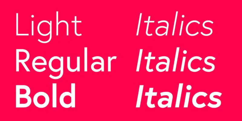
Europa’s restrained weight range of Light, Regular, and Bold keeps the family focused and versatile. Each weight maintains consistent proportions and character, making it straightforward to establish clear typographic hierarchy while ensuring visual cohesion across applications.
Best uses
- Brand identity systems requiring a clean, modern aesthetic
- Website headers and navigation where clarity is essential
- Editorial design for contemporary magazines and publications
- User interface design for apps and digital products
- Marketing materials and presentations
- Packaging design seeking refined simplicity
Thoughts
Europa excels at bridging the gap between classic geometric sans-serifs and contemporary design needs. Where Futura can sometimes feel austere or dated, Europa feels approachable and fresh while maintaining similar visual DNA. It’s particularly effective in branding contexts where clients want something modern but not trendy.
The typeface performs admirably across digital and print contexts. On screen, the slightly softened forms render cleanly at various sizes, avoiding the harshness that can plague more rigidly geometric designs. Its widespread availability on Adobe Fonts has made it a popular choice for web projects, and the consistent quality across weights means it scales well from body copy to display use.
References
Specimens
Europa on Adobe Fonts
Credit: Nootype
Europa Weights
Credit: Nootype

Europa ligatures
Credit: Nootype
Alternatives
- Futura PT by ParaType
- Avenir by Linotype
- Proxima Nova by Mark Simonson Studio
- Brandon Grotesque by HVD Fonts