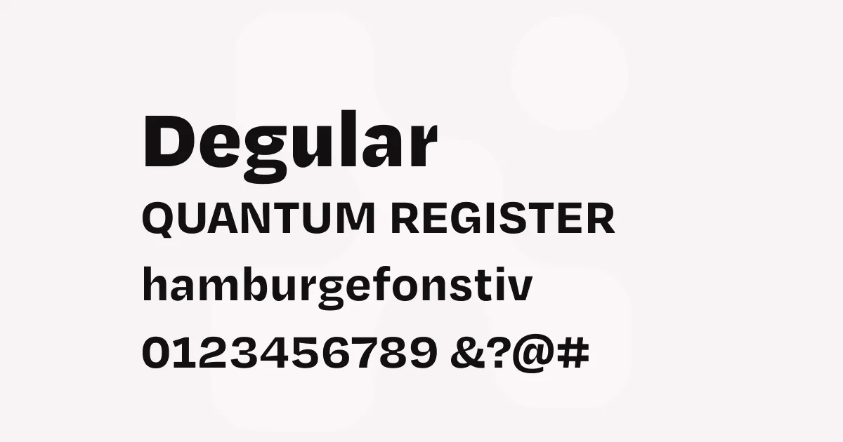
Degular
Description
Degular represents James Edmondson’s deliberate attempt to create a “boring” sans-serif that could serve as a reliable workhorse for corporate type systems. Unlike the exuberant display faces that typically emerge from OH no Type Co., Degular was designed to fade into the background and support content rather than demand attention. However, despite Edmondson’s intentions to create something completely neutral, Degular retains subtle personality traits that prevent it from being entirely conventional.
The typeface is available in three optical sizes: Degular Text (optimized for small sizes), Degular (the multi-purpose middle size excelling at 14-48 points), and Degular Display (designed for large headlines). Each optical size features carefully adjusted apertures, with the display styles featuring dramatically closed apertures that create distinctive texture in bold weights. The family includes stylistic alternates for select characters (a, g, t, G) and maintains consistent spacing across all weights, making it particularly suitable for complex typographic systems.
What makes Degular successful is its balance between geometric precision and organic warmth. While it draws from the grotesque tradition, subtle details like slightly curved terminals and carefully modulated stroke endings give it a more approachable character than purely mechanical alternatives.
Best uses
- Corporate communications and brand identity systems
- Editorial design for magazines and publications
- User interface design and digital applications
- Website typography and content management systems
- Signage and wayfinding applications where clarity is paramount
Thoughts
Degular succeeds precisely because it doesn’t try too hard to be noticed, yet it’s far from generic. Edmondson’s attempt to create something “neutral” resulted in a typeface that feels refreshingly honest—it has personality without being precious about it. The three optical sizes are genuinely useful, with the display cuts offering enough character for headlines while the text cuts remain remarkably readable at small sizes.
I’ve found Degular particularly effective in contexts where you need a sans-serif that can handle complex information architecture without feeling sterile. The stylistic alternates provide just enough flexibility to adjust the voice when needed, and the extensive weight range makes it genuinely versatile for establishing clear hierarchies. It’s the kind of typeface that grows on you—initially appearing straightforward, but revealing thoughtful details the more you work with it.
The fact that it comes from OH no Type Co. makes it feel like a well-kept secret among designers who appreciate good spacing and subtle personality over flashy distinctiveness.
References
Specimens
Degular on Adobe Fonts
Credit: OH no Type Company

Degular on Adobe Fonts
Credit: OH no Type Company
Degular on Adobe Fonts
Credit: OH no Type Company
Alternatives
- Inter by Rasmus Andersson
- Proxima Nova by Mark Simonson Studio
- Space Grotesk by Florian Karsten
- DM Sans by Colophon Foundry