Bricolage Grotesque
Description
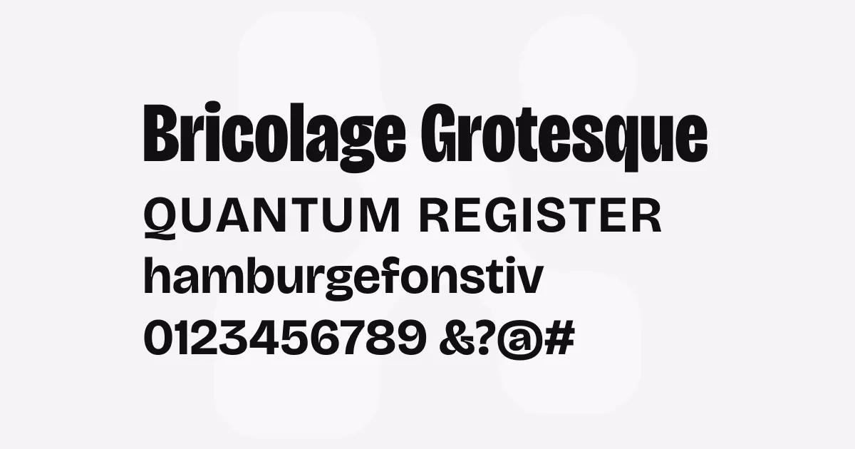
Bricolage Grotesque is an expressive variable font that blends iconic elements from French sources like Antique Olive and British sources like Stephenson Blake’s Grotesque series. It features three variable axes: weight, width, and optical size, allowing designers precise control over its appearance across different contexts.
“Bricolage” is French for improvising by combining readily available materials. The typeface’s name perfectly captures its nature as a thoughtful remix of historical references with contemporary sensibilities. The compressed weights lean toward the anxious and wonky tones of Grotesque No. 9, while the regular widths have more of Antique Olive’s relaxed and confident attitude.
Best uses
- Editorial design for headlines and pull quotes
- Contemporary branding and identity systems requiring personality
- Display typography with a balance of character and legibility
- User interfaces needing both distinctiveness and functionality
- Websites and digital applications at various screen sizes
- Print applications from small text to large format display
Thoughts
Bricolage Grotesque strikes an impressive balance between personality and functionality. Its “restrained quirkiness”, to quote Triay, allows it to be expressive without being overly decorative, making it versatile for both display and text purposes.
The variable font technology provides excellent flexibility across different applications. I’ve found the optical size axis particularly valuable when using the font across different contexts—the font genuinely transforms itself to maintain readability whether used in body text or display settings.
While many contemporary fonts aim for neutrality, Bricolage Grotesque deliberately embraces expression. It provides what the designer calls “the foundation of a feeling” without overwhelming the content it presents. In projects where I want typography with presence but not domination, this font delivers perfectly.
What makes this font particularly special is the personal story behind it. Mathieu Triay is a French designer based in London and the typeface visually expresses his experience of cultural hybridity, reflecting what it feels like to move between countries and rebuild one’s identity.
References
Specimens
Bricolage Grotesque as both headline and body text
Credit: Atelier Triay

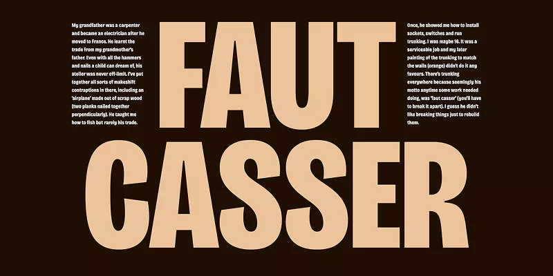
Bricolage Grotesque sample
Credit: Atelier Triay
Alternatives
- Antique Olive by Fonderie Olive
- Mayenne Sans by Studio Triple
- Grotesque No. 9 by URW Type Foundry
- Gangster Grotesk by Fresh Fonts