Apparat
Description
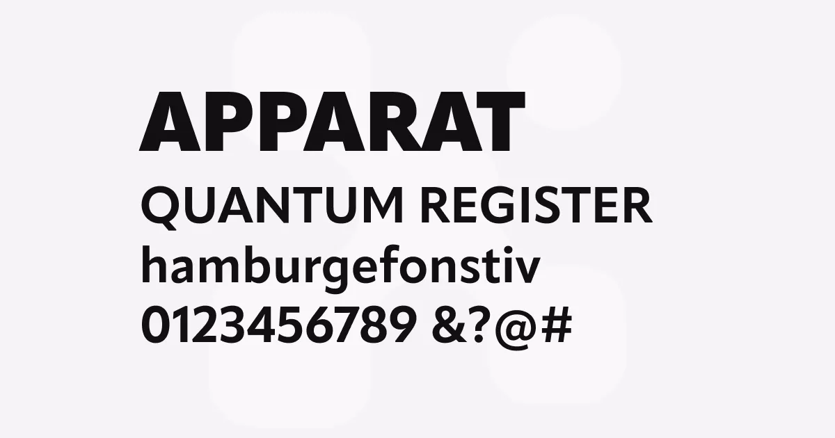
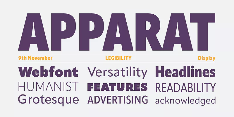
Apparat is a contemporary geometric sans-serif typeface that combines modernist principles with subtle humanist touches. Its clean lines and balanced proportions make it highly legible, while details like slightly curved terminals add personality.
The font family features consistent stroke contrast and carefully optimized spacing, making it versatile for both display and text settings.
Best uses
- Corporate communications and branding
- Editorial design and magazines
- User interfaces and digital products
- Wayfinding and signage systems
- Marketing materials and presentations
Thoughts
Apparat stands out for its excellent balance between geometric precision and subtle organic qualities. The font works particularly well in contemporary design contexts where clarity and personality are equally important.
Its range of weights provides good flexibility for establishing typographic hierarchy, while maintaining consistency across applications.
References
Specimens
Apparat example on Adobe Fonts
Credit: Lettersoup
Alternatives
- Neuzeit Grotesk by URW Type Foundry
- Brandon Grotesque by HVD Fonts
- Proxima Nova by Mark Simonson Studio
- Avenir by Linotype