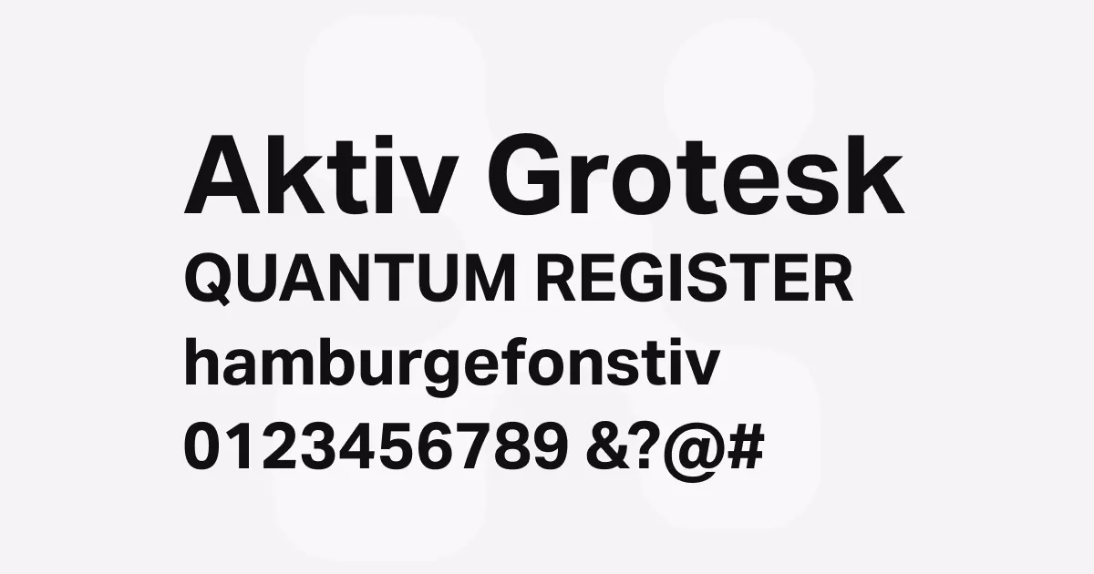
Aktiv Grotesk
Description
Aktiv Grotesk is dubbed the Helvetica Killer—and that’s the highest praise you can give to any grotesque sans-serif. It is a contemporary typeface that represents a thoughtful evolution of the genre.
Bruno Maag designed it as his answer to Helvetica’s dominance, striking a careful balance—keeping Helvetica’s neutrality but adding Univers’ warmth and approachability. The result? A typeface that doesn’t feel sterile or robotic. The sweet spot that is both authoritative and accessible.
One of Aktiv Grotesk’s most impressive features is its insane language support, covering ten global writing systems including Arabic, Cyrillic, Devanagari, and more. This makes it an excellent choice for international brands and multilingual projects.
The typeface also embraces modern technology with variable font capabilities, meaning you can fine-tune weight, width, and italic settings for optimal performance across different media.
The design features clean lines with subtle humanist touches that give it personality without sacrificing professionalism. Optical adjustments have been carefully made to enhance legibility across different sizes, with a slightly higher x-height than traditional grotesques, and open counters that improve readability in both print and digital applications. Or in simple terms—text actually readable instead of just looking “designed.”
Best uses
- Corporate branding and identity systems where neutrality and authority are essential
- Editorial design for magazines and publications requiring high legibility
- User interface design and digital products where clarity across multiple languages is crucial
- Wayfinding and signage systems that need to work across diverse contexts
- Web typography where variable font technology can optimize performance
- Marketing materials that require a balance of professionalism and approachability
Thoughts
I’ll start off with a confession that Aktiv Grotesk is my favourite grotesque. Whether it’s for UI elements or body text, it’s my go-to sans-serif typeface. So, the following is totally tinted with heavy bias.
Aktiv Grotesk stands out in the crowded field of grotesque sans-serifs by offering a truly functional alternative to Helvetica without feeling like a mere clone. The subtle warmth and character that Bruno and his team have infused into the design make it feel more human and approachable than many of its competitors, while still maintaining the neutrality that makes grotesques so versatile.
Helvetica is so neutral that it can come across cold. When Creative Review said hating Helvetica is pointless because it’s as “like air or vanilla ice cream”, Bruno’s reply was, “That’s the point, it is vanilla ice cream.”
“In my whole career in typography, starting with my apprenticeship, I have never used Helvetica. Being a Swiss typographer, it’s always been Univers. Even in my apprenticeship we didn’t have Helvetica in the printshop. Then I went to Basel school of design and of course in Weingart’s workshop it was Univers, never Helvetica. Then I come to England and there’s all these designers using Helvetica! The Macintosh had just come out and Helvetica was on every single machine. Everyone was so fascinated with it … I never understood that.”
I love Aktiv Grotesk because it is neutral without being generic. It is expressive without distracting from its purpose. The balance makes it a versatile typeface especially when creating visual identities.
When it comes to body text, readability is top priority. Character is a close second for me. Trends break out all the time for body text seen on websites: Inter, Work Sans, Proxima Nova, Open Sans, and Lato are some examples for the trends over the years.
Most of these became popular for good reasons - Inter was designed specifically for screens, Google Fonts made Open Sans and Lato accessible to everyone, and Work Sans was the “better” version of Source Sans Pro. But they’re everywhere now, which makes your site feel like… everyone else’s.
Aktiv Grotesk gets the job done without feeling generic. It has that crisp legibility you need for body text, but with enough personality that your content actually feels designed, not just typed up. The subtle warmth keeps it from feeling cold like Helvetica would, while still being neutral enough that it doesn’t fight with your message.
Plus, when everyone else is using the same five fonts, Aktiv Grotesk helps you stand out without being weird about it. It’s the perfect “quietly confident” choice—and the best part is it ages well. It doesn’t feel dated even after the trendy picks have faded.
References
Specimens
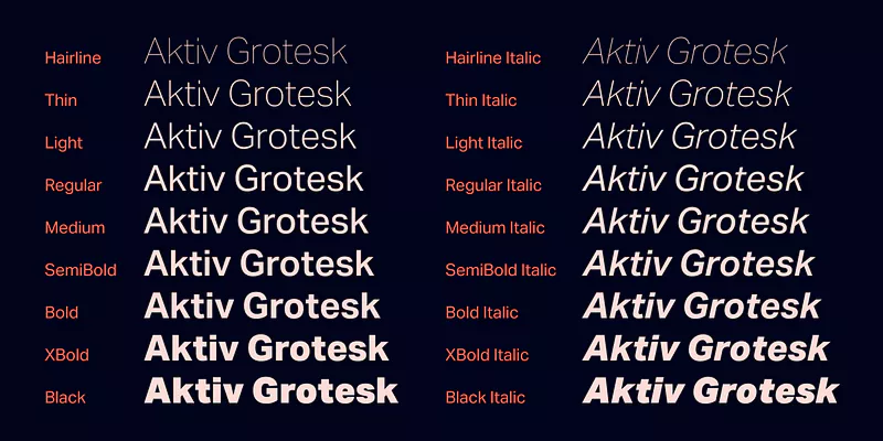
Aktiv Grotesk weight example on Adobe Fonts
Credit: Dalton Maag
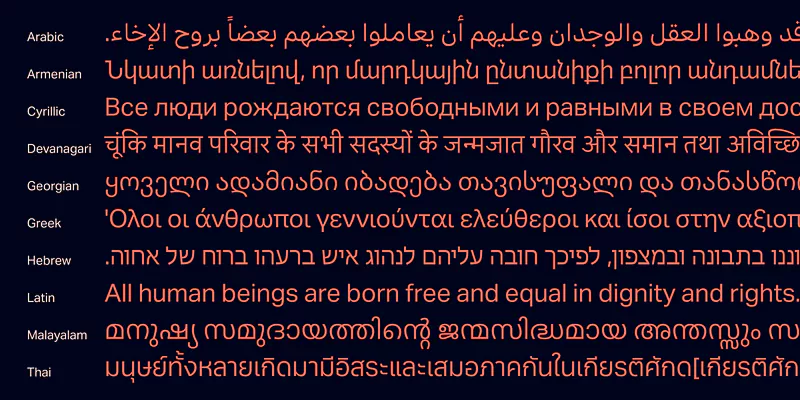
Aktiv Grotesk multi-script support on Adobe Fonts
Credit: Dalton Maag
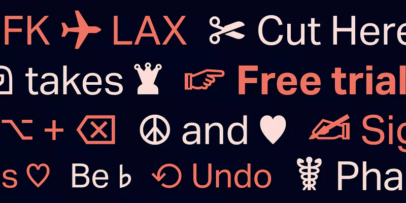
Aktiv Grotesk usage example on Adobe Fonts
Credit: Dalton Maag
Alternatives
- Helvetica Neue by Linotype
- Akzidenz-Grotesk by Monotype
- Neue Haas Grotesk by Monotype
- Brandon Grotesque by HVD Fonts